Make your website comfortable on a phone
Check overflow, heading breaks, reading order, image crops and controls, then repeat the journey on the published website.
Published
Edited by Lumitoha Team · Updated
About 4 min read
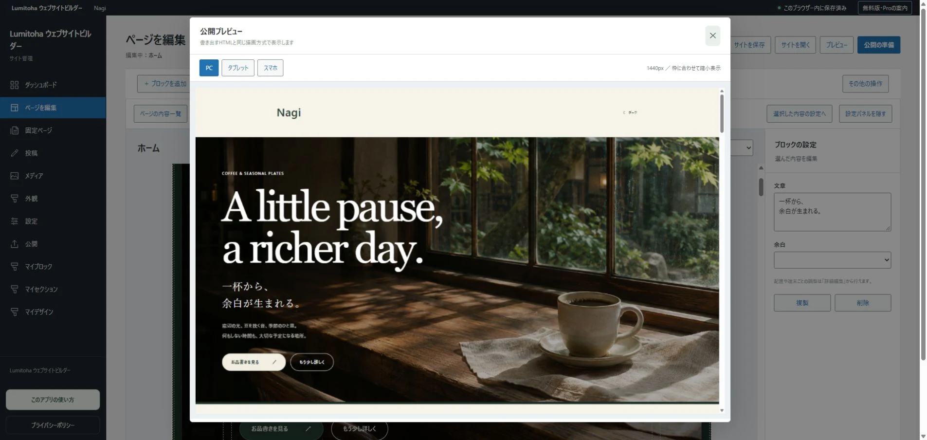
A mobile check needs to cover more than whether the page fits inside the screen. Review the reading order, image crops and controls as well. Begin with horizontal overflow, then look at headings, paragraphs, photos and interactive elements in that order. This makes it easier to understand what needs changing.
Lumitoha offers previews at different widths. Rather than simply shrinking the desktop view, watch how content rearranges itself and whether that new arrangement still makes sense to a reader.
1. Look for horizontal overflow
If the whole page moves sideways, look for an element wider than the viewport. A long URL, wide table, unbroken string or large image can be responsible. Find the source before reducing the size of every word on the page.
Scroll from top to bottom once. A single embedded item can affect the width of an otherwise sound layout. After fixing it, review the whole page again. There are many phone sizes: 375px is one useful starting point, not a complete guarantee. Browser differences and users’ text-size settings matter too, so check a real device where possible.
2. Read headings as meaningful phrases
A heading that fits on one desktop line can become three or four on a phone. Extra lines are not automatically a problem. Look for an isolated final character, an important expression split in an awkward place or a line break that makes the meaning difficult to follow.
Do not make every heading tiny just to force it onto one line. Shorten the wording or move a qualification into the paragraph instead. If you add a deliberate line break, check its desktop appearance too. Paragraphs also look longer on a small screen; separate changes of subject and organize repeated conditions without discarding the information people need.
3. Check the order after columns become a stack
A side-by-side image and text layout often becomes vertical on a phone. Decide whether the reader needs the explanation before the picture or the picture before the explanation. Review the resulting sequence rather than relying on the desktop relationship.
For a process, several photos followed much later by all their descriptions can be confusing. Keep each step and its explanation together. On pages with a sidebar, make sure useful supporting tools do not push the main article far down the screen. A search box is helpful, but someone who opened an article should not have to pass a long collection of extra information before reaching it.
4. Inspect photos and embedded content
Check that the important parts of faces, products and signs remain visible when the image frame changes ratio. Adjust the displayed position or choose a more suitable image where needed. If words sit over a photo, inspect the new background behind them: a bright area or a busy subject can make formerly clear text difficult to read.
When the combination is hard to resolve, separating the words and picture may work better. Test videos, maps and supported external content as loaded items, not just empty frames. Preview and live behavior can differ. A short explanation and a regular link can provide another way to reach useful information if an embed does not load.
5. Try the controls, not only the layout
Check the space around buttons and nearby links. A short word can still be difficult to select if its clickable area is small. Try the menu, category filters and page navigation in a continuous journey rather than considering each in isolation.
For input fields, check what happens when the on-screen keyboard opens, whether labels remain clear and whether errors can be read. Empty optional fields and incorrect input are normal parts of a user’s journey. On a computer, use Tab as well: the focused control should be visible, and expanded sections or image viewers should be possible to close.
6. Repeat the check at the public address
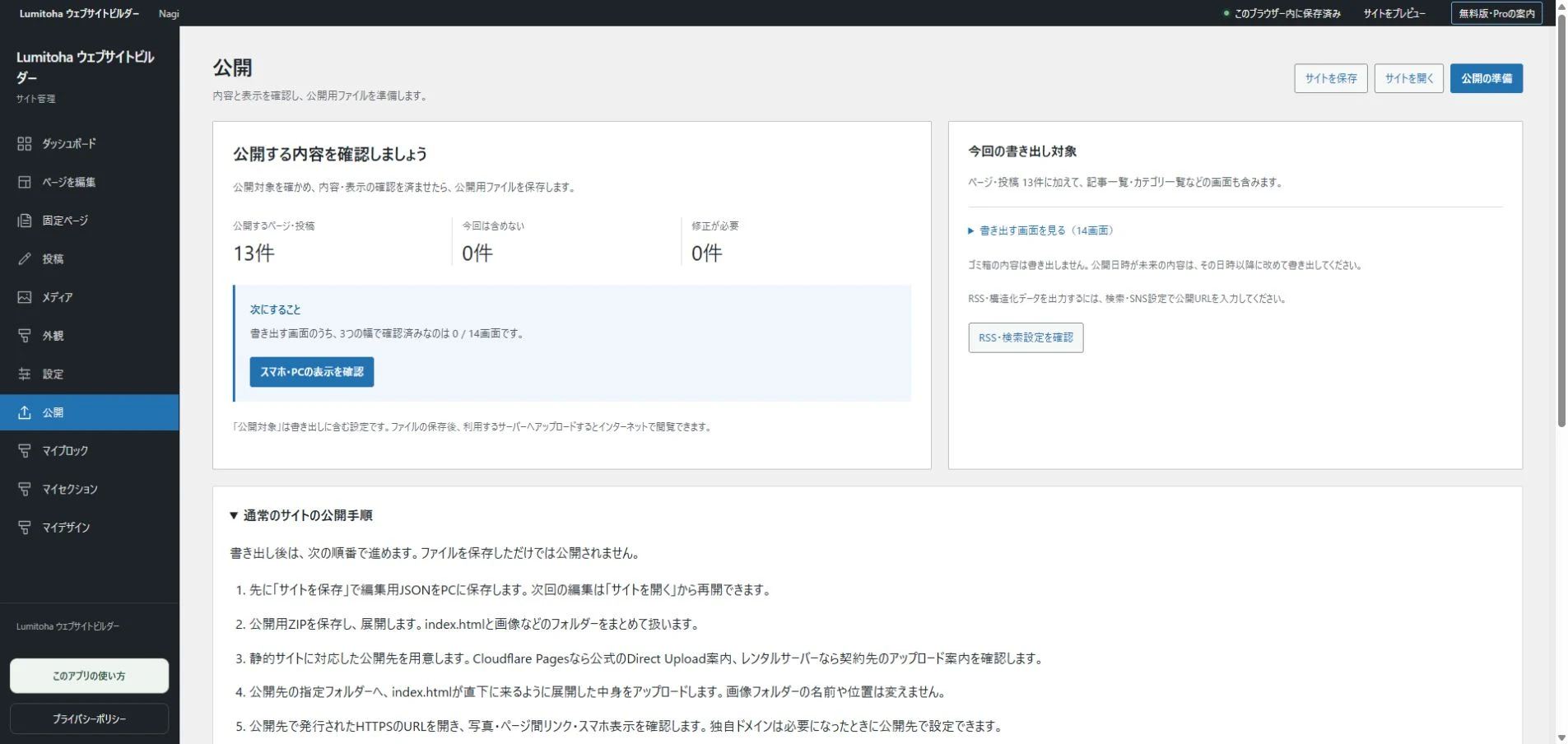
After previewing, save editable JSON and export the public files. Once they are uploaded, open the real website on a phone. Missing image uploads and links to other pages may only become obvious in the hosted environment.
Keep a short note of the widths, devices and changes you checked. You do not need to redesign the entire site every time. Pay particular attention to new content and the sections immediately before and after it. A comfortable small-screen journey is a useful test of the clarity of the whole website.
Editable JSON and public HTML/ZIP: the difference
Separate editable backups from public exports, organize versions and make saving, checking, exporting and uploading a repeatable routine.
Read moreFind your own balance of Free and Pro
Understand the free core, design previews and Pro’s extra tools, then decide using the work your own website actually needs.
Read moreGetting started with Lumitoha
From a finished design to saved work and public files.
Read moreShare this article
Share on Instagram
Copy the link and paste it into a Stories link sticker or a direct message.
Open Instagram
Comments
Your display name and comment appear after approval. Your email address is not public. Please read our privacy policy.
Comments (0)