Plan the pages of your first website
Start with visitors’ questions, organize the information and connect a small set of useful pages before refining the visual details.
Published
Edited by Lumitoha Team · Updated
About 4 min read
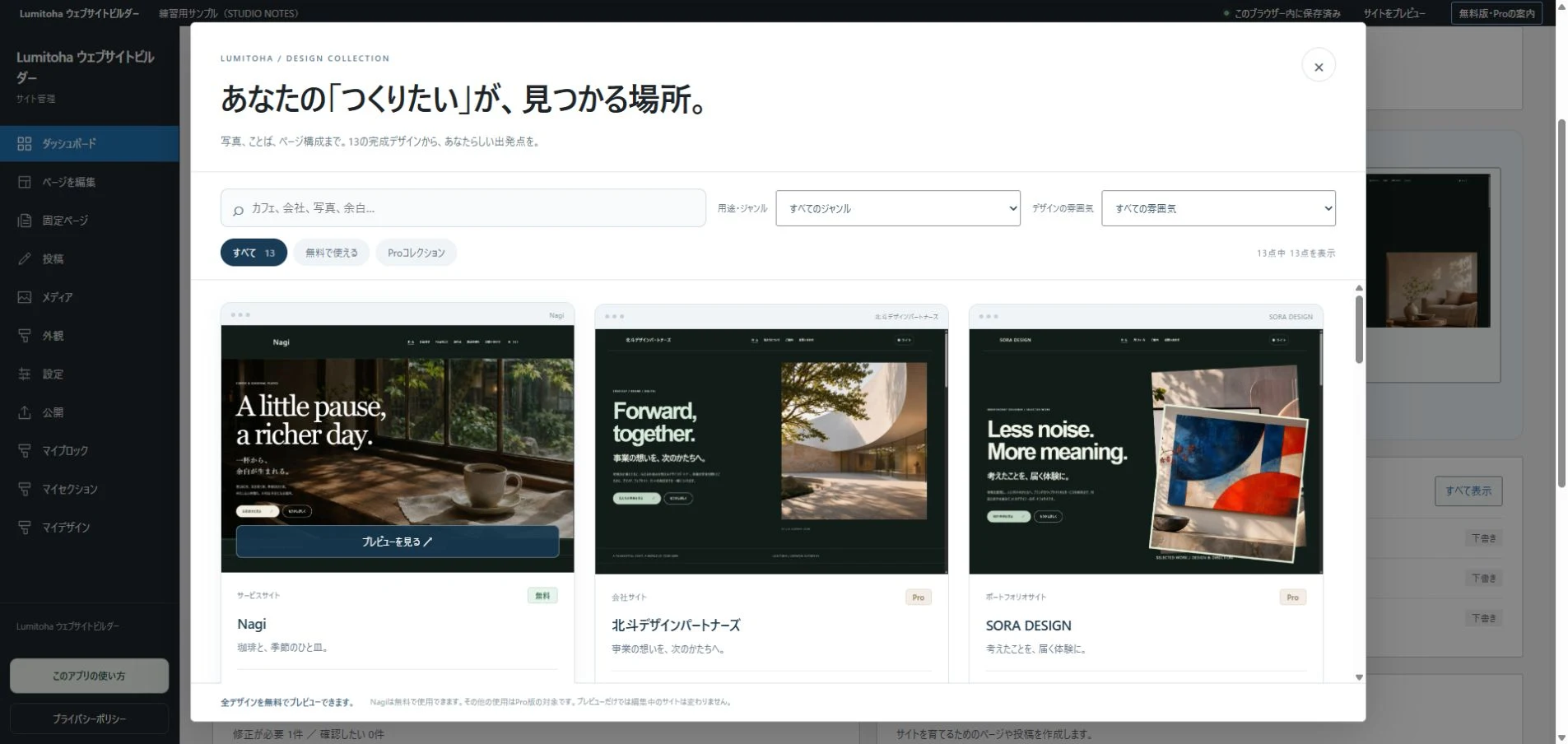
Planning a first website becomes easier when you begin with the questions visitors need answered. Give the site a one-sentence purpose, gather the information, divide it into pages and connect those pages with links. You can make a useful small plan before you have every photo or paragraph ready.
The same plan helps when choosing a finished design in Lumitoha. Instead of keeping every sample section, you can decide which parts your own content needs. Here is a way to organize a small shop, service or personal website from the reader’s point of view.
1. Begin with a visitor’s questions
You may have a long story and many things you want to show. A first-time visitor may initially need simpler answers: what you do, whether it is relevant to them and how to take the next step. Write those questions before deciding how the page should look.
For a class, useful questions might concern the subject, intended learners, location and joining process. Imagine signing up for the first time yourself. Then check whether you have the material to answer those questions. You may need another photo, a clear price list or a working contact route before changing the design further.
2. Sort the information into three groups
Separate an overview, detailed explanation and practical next steps. The overview tells people your name and what you offer. The explanation covers characteristics or background. Practical information includes access, contact or the steps needed to use the service. A paper list is enough at this stage.
You do not need finished prose yet. Distinguish confirmed details from information that still needs checking, and keep undecided prices or addresses out of the publishable draft. Note how frequently each detail changes. Opening days may change more often than an operator profile; giving changing information one clear home reduces the number of places you must update.
3. Start with a modest page structure
A small site can begin with Home, an explanation of your offer, About and a contact route. If there is little information, several roles can share a page. The number of pages is less important than whether someone can find what they came to learn.
Treat Home as an entrance, not a storage place for every detail. Introduce the subject, show representative features and offer routes to fuller explanations. Longer history or detailed conditions can have their own place. If you add a blog, keep permanent practical information in pages and use articles for ongoing stories, processes or seasonal topics. Important instructions should not disappear into an old post without a link from somewhere easy to find.
4. Give every page a question to answer
Write what someone should know after reading each page. A service page explains the offer and its intended audience; a portfolio shows the direction of your work; a contact page explains how to get in touch. If a page tries to do too many unrelated jobs, use clearer sections or separate it.
An approachable sequence is answer, concrete explanation, useful conditions and next action. For a class, describe what it is before presenting what people learn, participation details and contact information. Assign photos at the same time. Add an image because it explains atmosphere, scale or a situation, not merely because a space looks empty.
5. Make navigation labels predict their destinations
Menu names should help newcomers anticipate what they will find. Distinctive language can suit a brand, but “Our world” alone may not tell someone whether to expect an operator profile or product details. Keep important destinations such as prices, work and contact recognizable.
Place buttons where the next step makes sense: details after an overview, availability after a comparison, contact after relevant conditions. Repeating the same button after every paragraph is less helpful than letting visitors read what they need to decide. Forms and reservations also require a real receiving service. Check both the link and the service setup before presenting a button as a working contact or booking route.
6. Preview a small complete version
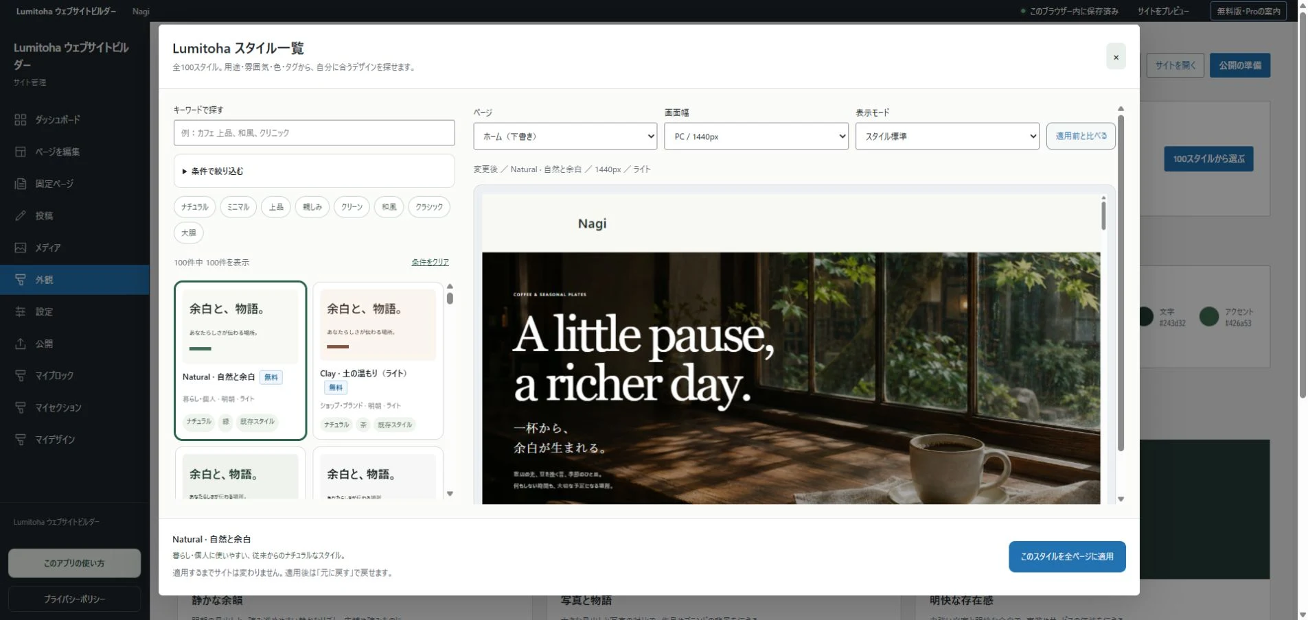
Once the plan is ready, choose a design in Lumitoha and edit the essential sections first. A short introduction and a few useful images are enough to test the order. It is easier to combine or divide pages before investing time in every decorative detail.
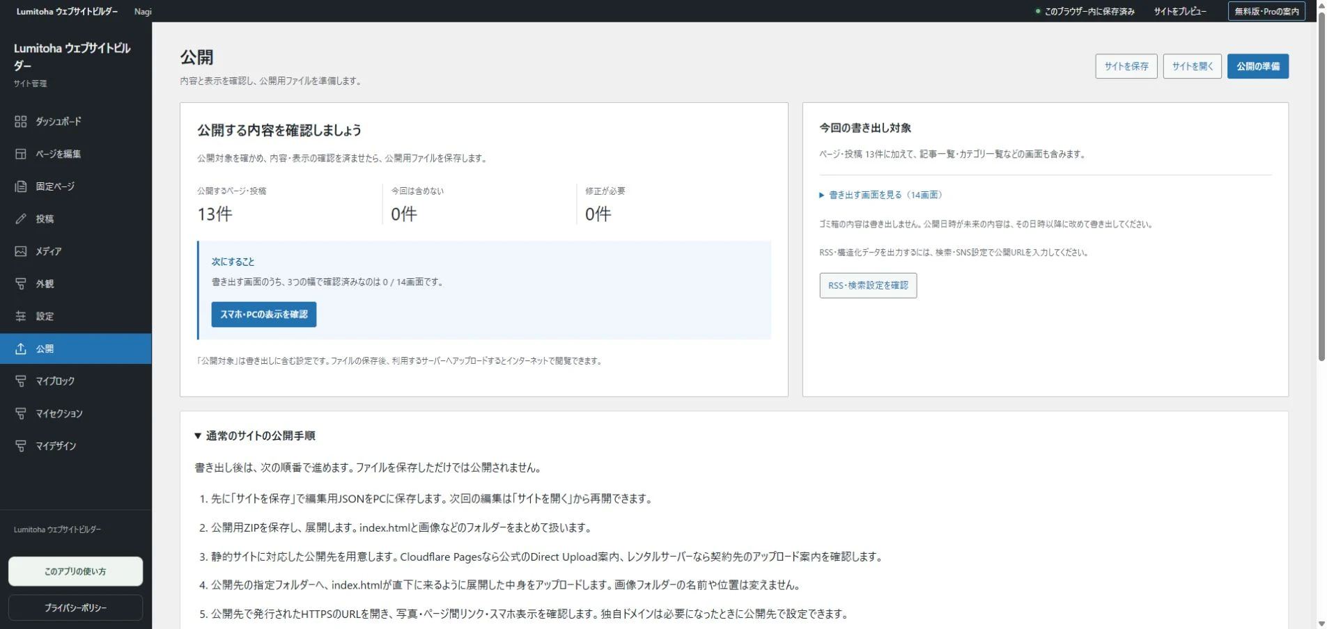
Walk from Home to the information you came to find. Notice unclear choices, repeated explanations and contact details that are difficult to locate. The plan is not a rule that must never change. It is a tool for making thoughtful decisions as you see your actual content on the screen.
Six ways to make your website writing clearer
Useful headings, one main idea per paragraph, specific explanations and meaningful link labels help readers find their next step.
Read moreMake your website comfortable on a phone
Check overflow, heading breaks, reading order, image crops and controls, then repeat the journey on the published website.
Read moreGetting started with Lumitoha
From a finished design to saved work and public files.
Read moreShare this article
Share on Instagram
Copy the link and paste it into a Stories link sticker or a direct message.
Open Instagram
Comments
Your display name and comment appear after approval. Your email address is not public. Please read our privacy policy.
Comments (0)