Give your photos room to breathe
Image roles, whitespace, cropping, readable overlays and helpful captions: six ways to make photos and words work together.
Published
Edited by Lumitoha Team · Updated
About 4 min read
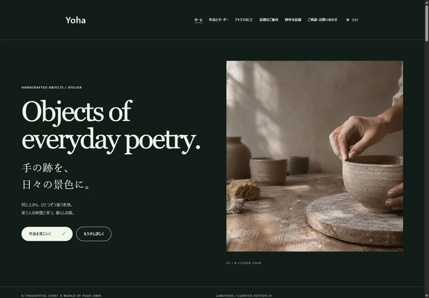
A photo-led page needs more than a large image. Give each picture a purpose, then consider its crop, the surrounding space and its relationship to the words. Start with one main image and the explanation that helps someone understand it, rather than filling every available area.
Photographs can describe the mood of a shop, the texture of an object or a service in use. These practical checks help you make room for that information while keeping the rest of the page clear.
1. Decide what each image should explain
List what visitors need to understand before choosing pictures. A café may need an interior view, a representative product and an image of the entrance. A portfolio may need a complete view, a close-up of a material and an example of the work in use. These are different jobs, even when the images share a subject.
Several photos with the same purpose can make it harder to know where to look. Choose a lead image and reserve supporting views for the details they reveal. At the same time, atmosphere alone may not answer practical questions. A product’s scale or the location of a doorway can be just as useful as a beautiful opening photograph.
2. Use space to show relationships
Whitespace tells readers which things belong together and where a new topic begins. Keep a product image close to its explanation, then leave more room before the next subject. That difference helps people understand the structure without reading every sentence.
Review the gap between the image and caption, the heading and paragraph, and the whole section and its neighbor separately. Making every gap identical can suggest relationships you did not intend. Begin with a small and a larger spacing rhythm. Before adding decoration to a page that feels empty, consider whether quieter surrounding elements would let the photograph work better.
3. Check the crop in the actual layout
An image may show everything in the original file but lose important edges inside a fixed-ratio frame. When putting a portrait photo into a wide space, check faces, product shapes and words on signs. A crop that removes useful information changes what the image can explain.
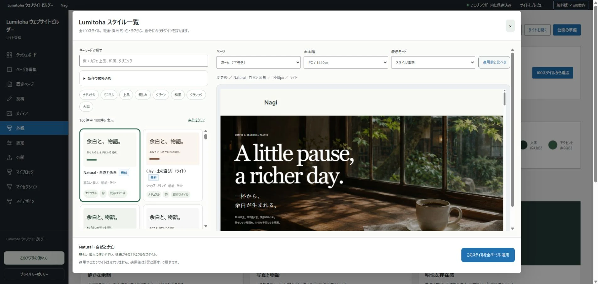
Photos with some space around the subject are easier to adapt. Choose according to what must remain visible, rather than always centering the image automatically. Use Lumitoha’s different preview widths to review the picture together with its nearby heading and explanation. On a phone, the subject might become too small or a long run of images might separate it from the words it belongs with.
4. Put readability first when text overlays a photo
Light and dark areas in the same image can make a headline difficult to read. Start by changing where the words sit and checking whether they remain distinct from the background. A color that suits the mood is not useful if the message disappears.
The crop can change on a small screen, moving a subject or a bright area behind the text. Check an actual phone where possible. If the combination remains difficult, separate the text from the image. Avoid baking essential instructions into an image: they cannot resize as independent text, and changing them means replacing the whole picture.
5. Give captions and image descriptions different jobs
A caption can explain why you chose a photo: the stage of a making process, a feature to notice or the situation being shown. “The surface before its final finish” adds information that may not be obvious just from looking.
Alternative text helps when someone cannot see the image. Use a concise description relevant to this page, not “Photo 1” or a filename. There is no need to repeat an entire long caption. If an image is a generated illustration or fictional sample, make that clear instead of presenting it as a real shop or customer project. Check the usage conditions of any material you publish.
6. Step back and look at the whole page
Check whether brightness, color and image shapes vary so much that they interrupt the story. You do not have to process every picture into exactly the same style. Decide which image leads, then ask whether the others support or compete with it.
Scroll through the finished page slowly. Do the photos make you want to read the explanations? Is the next piece of information easy to find? Before reducing a gap, consider what it currently separates. A thoughtful rhythm of pictures, words and space can make both the visual story and the practical details easier to receive.
A thoughtful checklist before you publish
Review facts, headings, links, mobile layouts, publishing targets and backups, then check the website at its actual public address.
Read morePlan the pages of your first website
Start with visitors’ questions, organize the information and connect a small set of useful pages before refining the visual details.
Read moreGetting started with Lumitoha
From a finished design to saved work and public files.
Read moreShare this article
Share on Instagram
Copy the link and paste it into a Stories link sticker or a direct message.
Open Instagram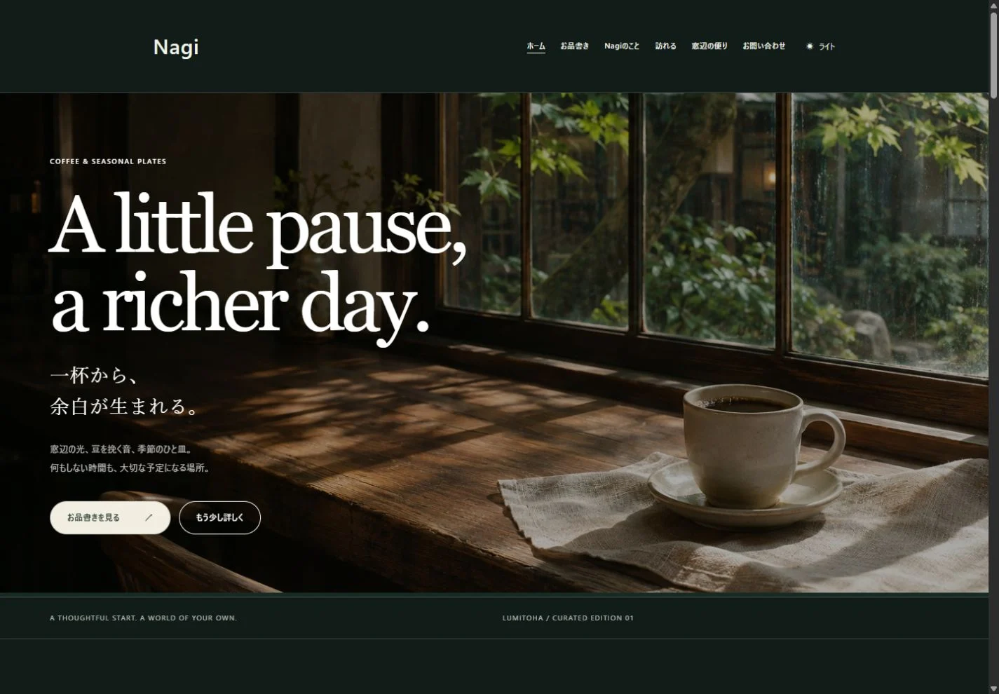
Comments
Your display name and comment appear after approval. Your email address is not public. Please read our privacy policy.
Comments (0)